Stop Gambling in the Stock Market. Be an intelligent and confident investor.
See what the professionals see with financial analytics, charts and valuation models.
Fundamental Analysis and Stock Valuation Simplified. Learn more.
See what the professionals see with financial analytics, charts and valuation models.
Fundamental Analysis and Stock Valuation Simplified. Learn more.
How to avoid major losses in the stock market
18-Jan-2013
Couple of our premium members forwarded us a link to a financial blog where the members of the blog confess how much they lost in the stock market. Majority of the members had 50% to 90% loss in their respective investments. So what we are going to do today is that we are going explain why some of the stocks were bad investments right from beginning. If you had even basic knowledge of fundamental analysis you would not have invested a single rupee in those companies. Don't worry this not another theory lecture which you see on most other websites. You will get some actionable insights which you can apply right now on your portfolio.
1) Opto Circuits
Looks like the number one loss making company for the members was Opto Circuits since it was analysed by the author of the blog (this is why you should not blindly trust the experts, including us). You just needed to look at one chart to figure out if the company was good or bad.
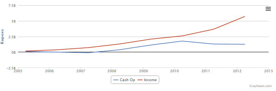
The above chart is the Net Income and Cash Flow chart. First look at the red line, that is the net income figure which in this case is positive and going up. The net income number also know as earnings is the number which management spews out during meetings, declaring results in the paper, during interviews etc. That is because earnings can be easily manipulated. How it can be manipulated, that will be posted in an another article.
The intelligent investor instead looks at the blue line which is the Cash flow from Operations since it is harder to manipulate. It provides a clearer picture of the operations. e.g If the company makes a large sale which provides a big boost to the earnings but if the company is having a hard time collecting the actual cash from the customer then that big sale is not really useful. Cash flow from operations captures such details. The above chart tells you three things.
1) you can easily see that Opto's cash flow was consistently lower than net income which is a big red flag (ideally it should be above the net income line)
2) in last couple of years it was diverging away from the net income line, another red flag.
3) In beginning even though net income was positive, cash flow was negative, another red flag.
So the question is do you want to invest in a company which is consistently having trouble collecting money from its customers.? This is why before investing you should always look at the Cash flow chart because it tells you the real story.
To Do - Check the Cash Flow from Operations chart for all the stocks which you have in your portfolio. The cash flow line should be higher than net income line.
2) Suzlon
Another famous company which was going to revolutionize the energy sector. What happened instead, its profit margins kept falling down while its debt kept on increasing.
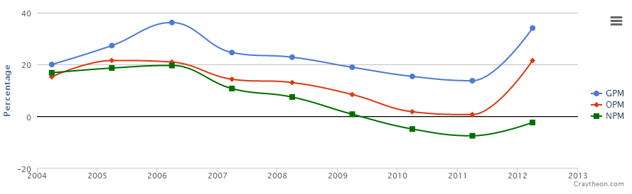
Never invest your money in a company whose profit margins are falling consistently. Suzlon's stock price declined from 330 Rs in 2008 to around 20 Rs in 2013.
To Do - Check the profit margin trends of the stocks in your portfolio, they should have stable or rising trend.
3) Sintex
Sintex is little tricky because if you look at the profit margin, return on equity charts everything looks fine but again the cash flow chart shows the real story. It is consistently lower than net income. We are not going to post the chart here, you can see it yourself here. Instead take a look at one the most important chart which is ignored by most investors, the free cash flow chart.
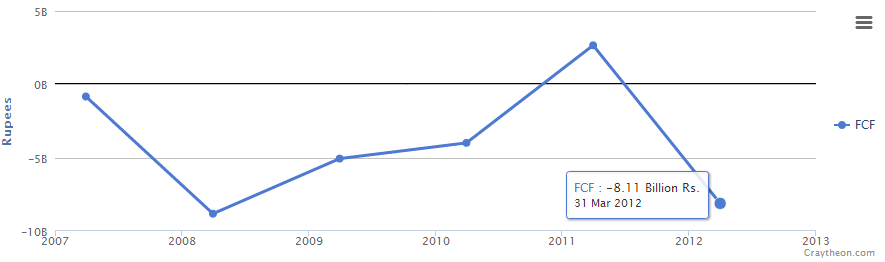
FCF represents the cash that a company is able to generate after spending the money required to maintain or expand its Property, Plant and Equipment (PPE) also called as Capital Expenditure (Capex). In simple words an ideal company generates lots of positive free cash flow. Sintex on the other hand has consistently generated negative fcf.
There are couple of more figures you should always check before investing
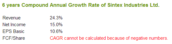
The 6 year Revenue growth rate is 24% but the Net Income growth rate is a modest 15% which means that the company is not able to control its expenses properly while the EPS growth rate is just 10.6%. The reason there is a huge difference in EPS growth rate is because Sintex is issuing more shares and diluting your shareholding which is a very bad sign. An ideal company is the one where all the growth rates are close to one another.
To Do - Check the FCF chart and Growth rates of the companies in your portfolio. Ideally your stocks should be generating lots of FCF and the Revenue, EPS growth rate should not show a huge difference.
This is how by looking at some crucial charts you can save your money and major headaches.
I hope our members don't commit these same mistakes. Any questions send us an email or you can add your comments below.